Riding the Mobile Wave: Crafting Unforgettable User Experiences through Mobile Responsiveness
Have you ever found yourself lost in the vast sea of mobile chaos, desperately seeking a way to navigate the tumult of unresponsive websites and disconnected digital experiences?
No more frustrations, no more compromises – just a smooth ride on the mobile wave toward a future where technology seamlessly aligns with your needs.
Get ready for a paradigm shift – your mobile journey will be revolutionized!
The Mobile Era: A Statistical Voyage
Before we embark on this journey, let’s toss around some staggering statistics. Did you know that, as of the latest data, there are over 3.8 billion smartphone users globally?
That’s more than half of the world’s population tapping and swiping away on their handheld companions.
Now, let’s talk about attention spans – the digital age currency. Studies show that the average attention span has dwindled to 8 seconds.
Yes, you read that right, 8 seconds! It’s less than the attention span of a goldfish.
In this fast-paced, mobile-centric landscape, every second counts. If your website or app fails to captivate users within those precious moments, you risk losing them to the ever-expanding digital sea. And here’s where the hero of our story emerges – mobile responsiveness.
Mobile Responsiveness Unveiled: Beyond the Buzzword
1. User Experience on the Move
Mobile responsiveness is not just a buzzword; it’s a game-changer. It’s about creating an online experience that seamlessly adapts to various devices’ screens, especially the pocket-sized ones we carry everywhere.
Consider this: 57% of users won’t recommend a business with a poorly designed mobile site. Ouch, right?
Think of your website as a welcoming haven for users, regardless of their device. A responsive mobile design ensures that your content looks just as stunning on a smartphone as on a desktop. It’s like tailoring a suit – one size fits all, but it fits perfectly.
2. The Need for Speed
Speed matters, especially in the mobile era. According to Google, 53%of mobile website visits are abandoned by visitors if a page takes longer than three seconds to load. Three seconds! That’s all you’ve got to capture your audience’s attention.
A mobile-responsive design doesn’t just adjust the layout; it optimizes the speed. It’s the difference between a stroll and a brisk sprint. Users want information at their fingertips without the agony of a loading spinner. Mobile responsiveness ensures your digital space is swift and agile.
3. Google’s Love for Responsive Design
Speaking of Google, let’s talk about SEO – the magical spell that determines your online visibility. Google favours mobile-responsive websites when ranking search results.
It explicitly states that mobile-friendliness is a ranking factor.
Why does this matter? 61% of people are unlikely to return to a mobile site they face trouble accessing, and 40% will visit a competitor’s site instead.
The digital landscape is competitive, and the Google algorithm is the referee. Mobile responsiveness is your ace card.
4. Visual Consistency Across Devices
Imagine this: your website looks like a piece of art on a desktop, but it’s a Picasso gone wrong on a mobile device.
Visual consistency is critical to creating a seamless user experience. Users should feel at home, regardless of the device they’re using.
With mobile responsiveness, your branding, imagery, and content formatting remain consistent, fostering a sense of familiarity for users.
Inconsistencies can lead to confusion and frustration, driving potential visitors away. So, let’s keep it visually harmonious across the digital spectrum.
5. Enhanced Accessibility for Diverse Audiences
Mobile responsiveness isn’t just about catering to the latest smartphone models; it’s about inclusivity.
In a world where digital access is necessary, ensuring your content is accessible to users across diverse devices is paramount. Mobile proxies can enhance this inclusivity by providing seamless access to content from various locations, ensuring users experience consistent performance and availability.
Consider different screen sizes, resolutions, and operating systems. A responsive design adapts to these variables, ensuring that your website or app is a welcoming space for users regardless of their chosen device. When planning your website, think about how custom website design services can help create adaptable layouts that provide a consistent experience across all devices.
Inclusivity is not just a design principle; it’s a commitment to reaching and engaging with a diverse audience.
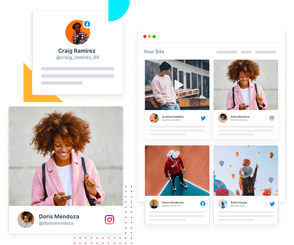
Tagembed: Elevating Mobile Responsiveness to a Community Experience
Now that we’ve sung the praises of mobile responsiveness, let’s talk about how Tagembed steps into the spotlight to make this experience even more magical. It isn’t just about compatibility; it’s about building a community around your content.
How Tagembed Makes Mobile Responsiveness a Community Affair
1. Seamless Integration on Any Screen
Tagembed is your digital chameleon, effortlessly adapting to screens of all sizes. Whether your audience is on a smartphone, tablet, or desktop, your embedded content looks stunning, creating a consistent and engaging experience.
2. Tailored for Speed
In the race against time, Tagembed ensures your embedded content loads swiftly on mobile devices. No more frustrated users staring at a blank screen; your community gets the content they crave without the wait.
3. Dynamic Content on the Go
Your community is on the move, and so is Tagembed. Embed your content on your website or app, and watch as your audience seamlessly interacts with it, whether they’re lounging on the couch or sipping coffee on a bustling city street.
4. Community Engagement Beyond Boundaries
With Tagembed, mobile responsiveness isn’t just about design; it’s about fostering a sense of community. Your audience can engage with your curated content anytime, anywhere, creating a shared experience that transcends device boundaries.
5. Analytics Insights in Your Pocket
Are you curious about how your community engages with your embedded content? Tagembed provides analytics insights that you can access on the go. Stay connected with your community’s preferences, trends, and interactions, all from the palm of your hand.
Wrapping Up!
As you integrate mobile responsiveness and embrace Tagembed’s community-centric ethos, remember that you’re not just crafting designs; you’re sculpting the future of digital interaction.
So, let’s ride this mobile wave with purpose, continue building connections, and pave the way for a digital era where communities thrive like never before.
The adventure is ongoing, and the possibilities are boundless – let’s explore, connect, and create together.
Embed social feed from Facebook, YouTube, Instagram, Twitter on your website, like a PRO
Invalid Email Address Multiple Themes